Sunday, January 24, 2016

Zipper Pulls

This project was one of my final ones during my internship and truly one I am very proud of because these zipper pulls were 100 percent designed and prepared by me. I was approached by my boss, Victor, with the problem that the zipper pulls currently on the market had issues with fraying and warping over time and that Tumi needed a new design to add to their accent kits, which allows customers to change the colors of some of the features on their bags such as monogram patches, luggage tags, and, yes, zipper pulls.

The old zipper pulls were basically just a thin strip of leather that you could knot onto the end of your zipper. The one I was asked to design would be a loop-through style, leaving only one "tail" to pull instead of the two that were left from the other style. 

First I drew up several different loop options on Illustrator:
Then I showed these six designs to Victor and he left his comments:
Unfortunately the photo got a little cut off but hopefully you can see that he liked the oval shape, the rounded square shape and the shape with a semicircular top, although he wanted to make the bottom curves a little more subtle. He also wanted to add an option that was a triangular shape with rounded corners.

So I fixed what I needed to and drew up a new one with the triangular design and then put those four onto a spec sheet to plan out the dimensions. This part was actually more fun than one might thing making a spec sheet should be because I had to use a caliper to measure the thickness of the leather in order to get the dimension of the opening in the center and then scale everything from there. 

I was struggling to get everything proportional at first so Victor taught me a fun little trick, which is using paper. He said that if you use real materials like paper and scissors to get a preliminary feel for what you're doing you can make real adjustments and then measure from that. So I cut out the shape I wanted in paper and then cut it down to the size I needed before taking the measurements. Here's a look at the spec sheet (notice my name next to the 'designed by' section!!):

After all the proportions looked good we sent this off to the manufacturers and a week or so later... voilĂ !

These are the first raw samples that came into the office. I say raw because they'll probably finish them off with edge painting or something to make them look more polished. Here are a few close ups:


It was a real accomplishment for me to have thought up, designed, and had manufactured my own product that's going to be sold to actual people. While I've made plenty of things, I will always consider this to be my real "first". Here's to many more to come!

Modified Screw

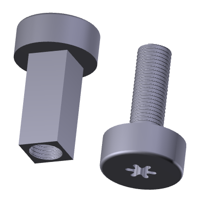
This was a really interesting project for me because it was the first time I was asked to produce something that wasn't going to be commercially sold or displayed, it was just a part. The problem to be solved here is finding a screw for a very thin handle of a suitcase. A normal screw wouldn't do the job because the handle was so thin that the end of the screw would stick out the other side of the handle. For this reason, I was asked to design a "double-sided" screw. That is, two pieces that screw into each other from opposite directions. Peter gave me an initial drawing of what he wanted it to look like and we went from there. Here's a look at what my screen looked like while designing the first version:


As you might be able to see from the second photo, these pieces required using multiple planes to stack all the parts together, especially the little indent where the screwdriver goes in. Another feature that was a first-time-use for me was a spiraled extrusion, which I used to put the grooves onto the main body of the screw. Here are some better photos of the final first version:


I showed this to peter, and, while the general idea was correct, he wanted me to try and make the base with slanted edges and the body a little skinnier. The reason for the slanted edges of the base is that we wanted it to be as flat as possible against the surface of the handle, so the screw would actually be screwed deep enough that the base would rest within the handle and the surface would be completely level. Here's a look at version two:


I made this version into a SolidWorks drawing to show the dimensions to Peter and he made some corrections on that.

From this version you can see that he wanted to try a version where the "outer" screw featured a rectangular body instead of cylindrical. We also went back to the original width for this one because of the extra space needed to fit the rectangular shape on the base with a cylindrical hole on the inside. Take a look:
I decided to show a picture of this version with the two pieces fitted together, that way it might give a clearer picture of the final idea. The suitcase handle would be in the middle and you would see the two ends on either side. However, we still wanted it skinnier and Peter had a few other modifications. Here's a look at his third round of corrections:

So I made a fourth version, trying to get the body a thin as possible without being unrealistic about the durability of the metal. I also rounded out the edges of the base for a more polished look, forgoing the embedded base with slanted edges.

This ended up being the final version I gave to Peter. And as you can see, even for something as small as a screw on a handle, it took four different versions to get the right look, reinforcing the idea that every detail matters. I think that paying attention to every detail requires having a preference for every detail, and that requires a strong brand identity. Tumi's brand identity is strong in every way: it shows by what they hang on their walls, the way they present their merchandise and the way the team is managed. I'm so grateful that now I have such a high standard of comparison. Up next is a project I'm really proud of: accent kit zipper pulls!


Wednesday, January 20, 2016

Luggage Tag Hardware

Another piece of hardware I helped to design and prepare is a small (read: very small) metal object to be placed as a fixture on a luggage tag. First Mike gave me his Illustrator drawing of what the design should look like and some basic dimensions.


You can see by the drawing on the right where this piece would go on the leather tag. This piece was fun for me because it gave me the chance to play around with the dome feature on SolidWorks and gave me so much respect for the designers in that office and around the world who do this type of stuff every day, putting immense amount of thought into minuscule details in order to obtain the perfect design.

Below are two different angles of the final version of the piece on SolidWorks.


The from SolidWorks I created a drawing, which allowed me to produce a lot of the dimensions automatically, but then I had to transfer it over to Illustrator to add in some others. Here's a look at the final spec sheet.


Sorry I don't have too much to say about this piece, but it's nonetheless an interesting little project to showcase and a polished looking finished product. Plus it gave me more experience working with different softwares. Next I get to talk about one of my favorite pieces I did all summer: the modified screw.


Friday, January 15, 2016

Key Fob

For one of the projects I aided in designing a key fob, but instead of starting out with a sketch and then taking it through the CAD process and finishing with a spec sheet translated from SolidWorks like I usually did, I was given a spec sheet initially along with a photo of another design that had a similar concept to this one.

This approach made some aspects of the process easier but also came with new challenges. I was already given the dimensions which was helpful but also took some maneuvering within SolidWorks to get everything to work together the way it's supposed to. Also the fact that I was given a more specific and precise design from the start left me less wiggle room creatively to accomplish the goal. Take a look at the original spec sheet I was given:

The idea here was to make a magnetic key fob (of two separate parts) that would lock into place with a twisting motion. Therefore the top piece features three little feet which would have magnets on the smallest face. These would match up with magnets in the bottom piece that are also on the smallest face of the indentation meant for the foot to slide into. 

Here are two images of the top piece from different angles:


Hopefully this gives a better picture of what the fob is supposed to look like (which was the general purpose of the task in the first place - to aid the manufacturers in understanding the design). And here are a couple of photos of the bottom piece, which might be a little less clear (these photos are all still shots of what were originally 3D PDFs).


As you can see from the original spec, these are just the central pieces of the key fob and would later have key rings attached. 

I was also asked to make another version of this key fob that, instead of having feet that fit into slots, featured a helix shape with a magnet at the bottom so the two halves would attract in a twisting motion. Unfortunately I don't have photos of that one, but the general concept is the same as the one shown above.

Next I'll talk about another hardware project I did for the Men's department.


Women's Hardware: Logo Plaque

The other project for the Women's department that I helped out with was creating a new logo plaque for their products. This plaque, while similar to the one I made for Men's in that they both comprise of a small piece of metal with the Tumi logo debossed into the surface, the women's plaque design is bigger in size and will be in either a gold or brass colored metal. Larger and flashier hardware are some of the small changes one often sees with the brand when translating men's to women's design.

We've already seen the sketch of the three hardware options I was given in the previous post, but I'll show it again here, highlighting the sketches this post focuses on inside red boxes.


You might notice that here, too, there are different versions of the plaque on the sketch. One looks like more of a square shape (although it is actually rectangular, not square) and the other has a curved top edge. The original idea for the plaque was to have the plaque be flat on all four sides, however the product that the plaque was being designed for featured a curvature to its design. Therefore I was also asked to render up a version that featured the same curved edge. Here are the two versions:


While these designs are fairly simple, they gave me a lot of practice with SoldWorks and later Illustrator, which to me is invaluable. Next up I'll write about a key fob design I helped make.


Women's Hardware: Bag Clasp

While most of my work for Tumi this summer was with their Men's department, the team worked very closely with the Women's department, sharing office space and collaborating on themes and styles. This being the case, I was given the opportunity to help out with some of the Women's designs as well, although it was mostly just for hardware designs so the gender difference didn't really play a large role here.

I was given three initial ideas in sketch form (Illustrator and free-hand) from Pam, an incredibly dedicated member of the Women's team, of which two illustrated a concept for a lock or clasp to put on the closure flap of a bag or backpack. The third is a logo plaque, which I will detail in another post. Below, within the red boxes are the two different clasp concepts.


My task was to render up versions of these ideas on SolidWorks so that we could send a 3D pdf along with the 2D sketches to the manufacturers. It might be a little difficult at first to notice the difference between the sketches on the upper left corner to the one on the lower right. The sketch on the lower right shows just the clasp and the hinge, without the thick casing you see around it on the upper left.

Here I will only show pictures of the design with the casing because if you wanted to instead make the simpler version, you would just forgo the casing (which is separate) and replace it maybe with a flat ring around the opening. Here are three images of the rendering I did for the clasp with the casing.


So as you can see from the two different angles of the images, the part with just the casing and the opening would be fastened to the top flap of any bag or backpack and the actual clasp piece that goes through the slot would attach to the main body of the bag and then fold over to lock. Next, I'll talk a little bit about the other hardware piece I did, the logo plaque.


Thursday, January 14, 2016

Wallets

One of my favorite projects I got to work on at Tumi was helping out with designing new wallet styles with some members of the Mens department. I was given a few basic guidelines about what type of wallet they were looking to develop (i.e. with an ID slot, etc.) and then I went to do market research on what types of wallets were being produced by trendy, up-and-coming or established brands. From this research I was able to (very roughly) sketch out some basic concepts I saw recurrently in men's wallets and small leather goods. 
You'll notice that some of these preliminary drawings feature a curved line. This is because this particular collection was to be featured in conjunction with a men's collection of larger leather goods that also have this curvature as a main design feature. Therefore it was important that I incorporated this shape into my designs. 

Working from these initial sketches I was able to make more polished drawings of the concepts that the team members were most excited about. Here are two of the best ones:

These wallet designs feature die cut card slots, as opposed to layered leather,  which gives the wallet a more elegant and elevated style. This line of wallets will come at a higher price than others, so we were definitely trying to elicit a more elegant and refined look. While this choice of cut would allow for more fraying of the leather, we have to assume that a consumer of this product is someone who clearly values his own personal style and the quality of the pieces he purchases. Thus it is safe to presuppose that the wallet would be well-looked after by any potential owner.

Next, I was able to translate my design onto Illustrator to give a more precise and to-scale picture of what would potentially be developed. Here is an example of a wallet I rendered; it's a double billfold with a center flap that holds an ID slot as well as additional card slots for the global customer:


 In the end, it appears that Tumi opted to include the card slots by layering the leather, which of course provides the customer with a sturdier wallet that is guaranteed to last for years. Here is a look at two wallets on the website featuring the curved card slots and an ID case. These wallets appear in the Monaco collection.

Photo taken from Tumi.com
These two photos above are of the Global Center Flip ID Passcase, one photo of each side of the center flap. It's easy to see the attractiveness of this wallet to any frequent traveller as it contains more than 8 card slots as well as multiple pockets for bills, tickets, photographs or anything else you may want to keep on hand.

This next photo is a different version that comes without an ID slot and offers six card slots. It is a little slimmer but still features two bill pockets and the incredibly advanced ID Lock that is a feature unique to Tumi, protecting against identity theft.

Photo taken from Tumi.com

I have to say it has definitely been a high point of my 2016 seeing designs that I contributed to being produced and out on the market. It's a very encouraging experience and the fact that something like this can give me such satisfaction and fulfillment really reassures me that I am pursuing a career that will make me happy and take me far. Anyway enough sappy stuff, next up: women's hardware!